[フロントエンド] CSS3のFlexboxの使い方(コンテナ編)と、プロダクション利用時の考慮点
こんにちは、@yoheiMuneです。
Flexboxは仕様が非常に豊富で、使えるようになると色々とできて楽しい限りです。Flexboxが使えるようになることを目指して、今回と次回の2回に分けてブログに書きたいと思います。
今日はFlexコンテナ側のスタイルについて色々とブログに書きたいと思います。
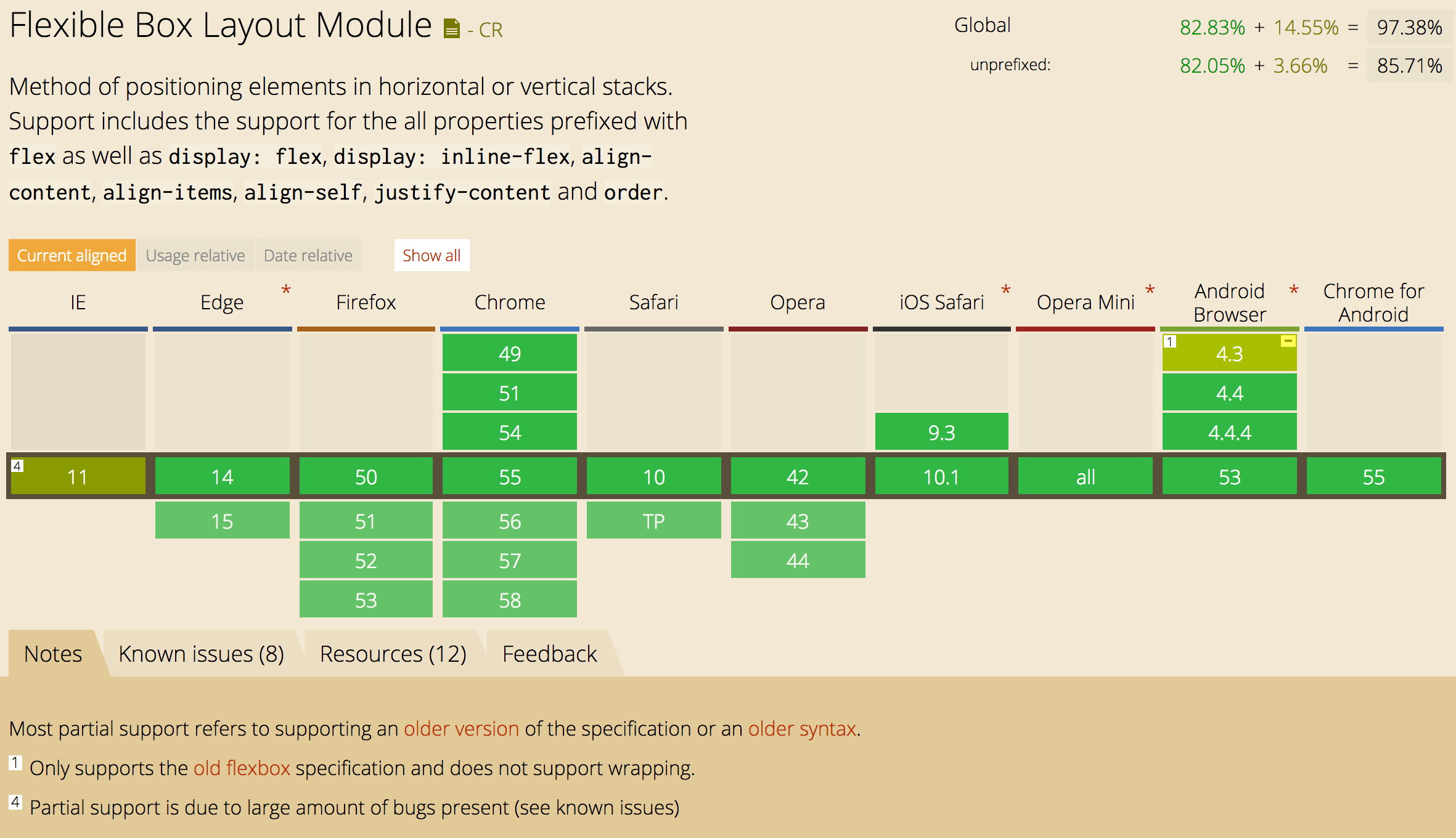 http://caniuse.com/#search=flex
下記2点を注意すれば、プロダクションでも利用できます。
以前職場で、一部のAndroid端末で表示が崩れるという報告があり調べてみたところ、このFlexboxが未対応(行折り返し指定が動かない)ものがありました。古い環境のサポートは色々と大変ですね。
CSS Flexible Box Layout Module Level 1 | W3C(いわゆる仕様書です)
CSS3のFlexboxを基本から理解して、使い倒そう! | 株式会社LIG
CSS3 Flexbox の各プロパティの使い方をヴィジュアルで詳しく解説 | コリス
A Complete Guide to Flexbox | CSS-Tricks
CSS3 Flexible Box | w3shools.com
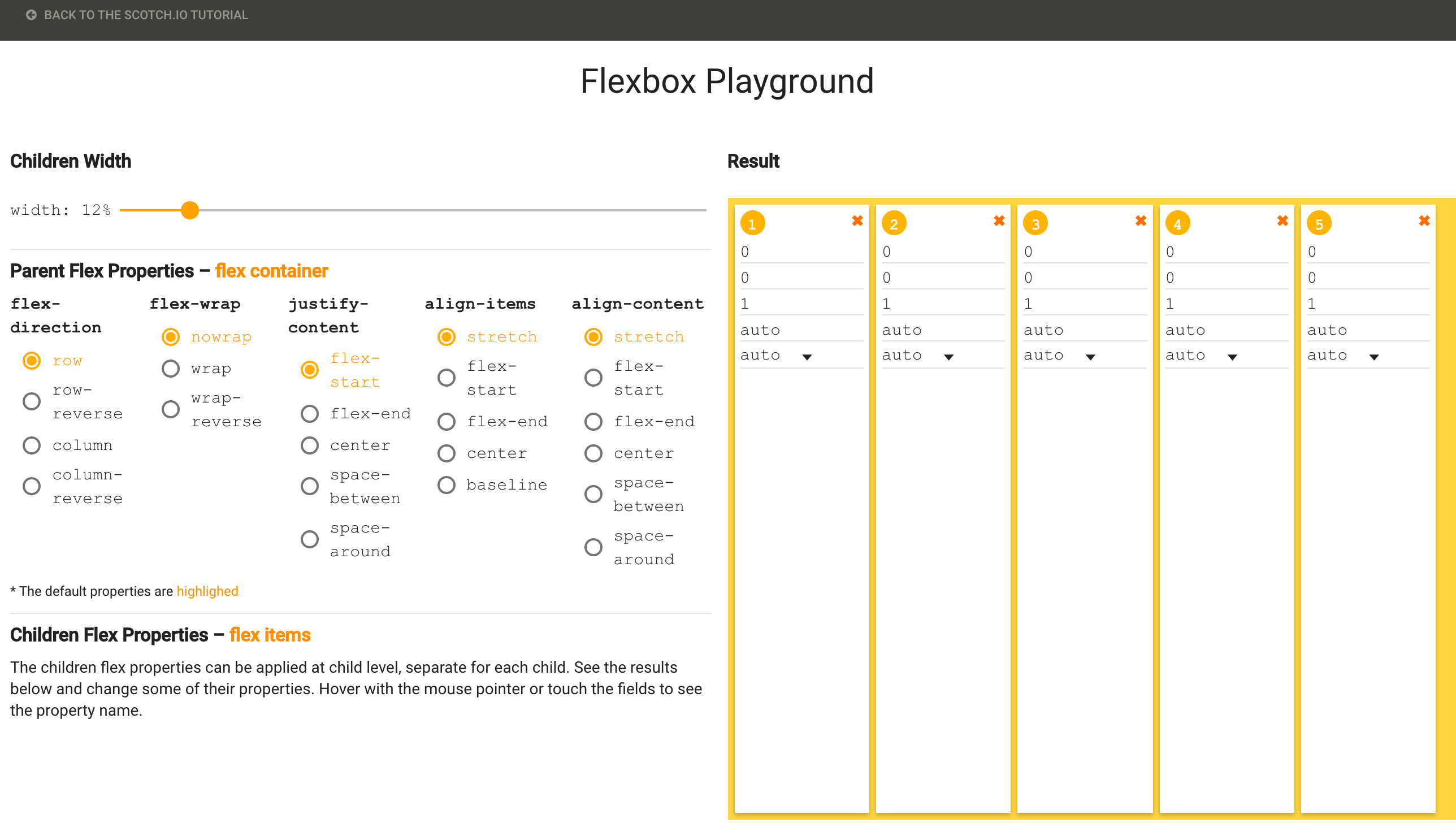 https://demos.scotch.io/visual-guide-to-css3-flexbox-flexbox-playground/demos/
次回は、Flexアイテムに対するスタイルをブログに書けたらと思います。
最後になりますが本ブログでは、フロントエンド・Go言語・Node.js・Python・Linux・開発関連・Swift・Java・機械学習など雑多に情報発信をしていきます。自分の第2の脳にすべく、情報をブログに貯めています。気になった方は、本ブログのRSSやTwitterをフォローして頂けると幸いです ^ ^。
最後までご覧頂きましてありがとうございました!
Flexboxは仕様が非常に豊富で、使えるようになると色々とできて楽しい限りです。Flexboxが使えるようになることを目指して、今回と次回の2回に分けてブログに書きたいと思います。
本ページでは、実際にFlexboxを使ってデモを表示しています。表示がおかしい場合は最新のChromeやFirefoxでご覧ください。
目次
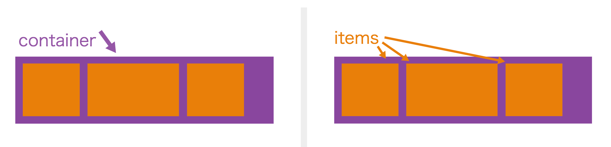
Flexboxとは
FlexコンテナとFlexアイテムの2要素からなるスタイルで、ボックスを自由に配置することができるCSSです。前にはdisplay:boxでしたが、W3Cの仕様書でも勧告候補(Candidate Recommendation)となっておりdisplay:flexに仕様が落ち着いたようです。(W3Cの勧告プロセスはW3C勧告プロセスの概要を参照ください)
引用:A Complete Guide to Flexbox | CSS-Tricks
今日はFlexコンテナ側のスタイルについて色々とブログに書きたいと思います。
その前にサポート状況とプロダクションでの利用
2017年1月でのFlexboxのサポート状況は以下の通りです。
http://caniuse.com/#search=flex下記2点を注意すれば、プロダクションでも利用できます。
- IEをサポート対象に含める場合、
-ms-プレフィクスを付けて利用し、複雑なことは行わずテストをしっかりと行う(いくつか不具合もあるようです)。 - Android4.3以前に搭載された標準ブラウザが部分サポートなので、そのユーザーにはAndroid Chromeの利用を促す(またはIEのように
-webkit-プレフィックスを付けてテストを頑張る)。
以前職場で、一部のAndroid端末で表示が崩れるという報告があり調べてみたところ、このFlexboxが未対応(行折り返し指定が動かない)ものがありました。古い環境のサポートは色々と大変ですね。
Flexコンテナに対するスタイル
本日のブログではFlexコンテナとFlexアイテムのうち、Flexコンテナに対するスタイルを紹介したいと思います。ベースとなるHTML要素とスタイル
今回の説明では、以下のスタイルをベースに説明したいと思います。ベースとなるスタイル
1
2
3
HTML
<div class="flex-container">
    <div class="flex-item">1</div>
    <div class="flex-item">2</div>
    <div class="flex-item">3</div>
</div>
CSS
/**
    Flexボックスのスタイル
*/
.flex-container {
    display: -webkit-flex; /*Android4系考慮*/
    display: -ms-flex;     /*IE考慮*/
    display: flex;
}

/**
    色やサイズなど見た目に関するスタイル
*/
.flex-container {width: 200px; height: 80px; border:1px solid #ccc; text-align: center; line-height: 50px;}
.flex-container > .flex-item {width: 50px; height: 50px;}
.flex-container > .flex-item:nth-child(3n) {background: rgba(255,0,0,0.3);}
.flex-container > .flex-item:nth-child(3n-1) {background: rgba(0,255,0,0.3);}
.flex-container > .flex-item:nth-child(3n-2) {background: rgba(0,0,255,0.3);}
flex-direction:子要素の配置方向
flex-directionを利用すると、配置方向を横や縦や逆順などを指定できます。横配置(row)※未指定の場合の初期値
1
2
3
<div class="flex-container direction-row">
    <div class="flex-item">1</div>
    <div class="flex-item">2</div>
    <div class="flex-item">3</div>
</div>
<style>
.direction-row {
    flex-direction: row; /*横に配置(初期値)*/
}
</style>
縦配置(column)
1
2
3
<div class="flex-container direction-column" style="width:80px; height:200px;">
    <div class="flex-item">1</div>
    <div class="flex-item">2</div>
    <div class="flex-item">3</div>
</div>
<style>
.direction-column {
    flex-direction: column; /*縦に配置*/
}
</style>
横配置で逆順(row-reverse)
1
2
3
<div class="flex-container direction-row-reverse">
    <div class="flex-item">1</div>
    <div class="flex-item">2</div>
    <div class="flex-item">3</div>
</div>
<style>
.direction-row-reverse {
    flex-direction: row-reverse; /*横に配置(右から左へ)*/
}
</style>
縦配置で逆順(column-reverse)
1
2
3
<div class="flex-container direction-column-reverse" style="width:80px; height:200px;">
    <div class="flex-item">1</div>
    <div class="flex-item">2</div>
    <div class="flex-item">3</div>
</div>
<style>
.direction-column-reverse {
    flex-direction: column-reverse; /*縦に配置(下から上へ)*/
}
</style>
flex-wrap:子要素の折り返し
flex-wrapを用いることで、横1行(または縦1列)に全ての子要素を配置できない場合の、折り返し方法を指定することができます。折り返さない(nowrap)※未指定の場合の初期値
1
2
3
<div class="flex-container wrap-none" style="width:120px;">
    <div class="flex-item">1</div>
    <div class="flex-item">2</div>
    <div class="flex-item">3</div>
</div>
<style>
.wrap-none {
    flex-wrap: nowrap; /*折り返ししない(単一行)。収まるように幅が狭くなる.*/
}
</style>
折り返す(wrap)
※折り返した際の余白はalign-contentで指定します。
1
2
3
<div class="flex-container wrap" style="width:120px; height: 120px;">
    <div class="flex-item">1</div>
    <div class="flex-item">2</div>
    <div class="flex-item">3</div>
</div>
<style>
.wrap {
    flex-wrap: wrap; /*折り返す*/
}
</style>
逆順で折り返す(wrap-reverse)
1
2
3
<div class="flex-container wrap-reverse" style="width:120px; height: 120px;">
    <div class="flex-item">1</div>
    <div class="flex-item">2</div>
    <div class="flex-item">3</div>
</div>
<style>
.wrap-reverse {
    flex-wrap: wrap-reverse; /*折り返す(折り返し地点が逆になる)*/
}
</style>
flex-flow:flex-directionとflex-wrapをまとめて指定する
flex-flowを使うと、flex-directionとflex-wrapを一度に指定することができます。flex-flowの利用例
1
2
3
<div class="flex-container flow-column-wrap" style="width:120px; height: 120px;">
    <div class="flex-item">1</div>
    <div class="flex-item">2</div>
    <div class="flex-item">3</div>
</div>
<style>
.flow-column-wrap {
    flex-flow: column wrap; /*縦表示、折り返し許可*/
}
</style>
justify-content: 水平方向の揃え方
flex-directionで指定した配置方向をベースに、水平方向(縦配置の場合は垂直方向)の並びを指定します。左揃え(flex-start)※未指定の場合の初期値
1
2
3
<div class="flex-container justify-start" style="width:250px;">
    <div class="flex-item">1</div>
    <div class="flex-item" style="width:100px;">2</div>
    <div class="flex-item">3</div>
</div>
<style>
.justify-start {
    justify-content: flex-start; /*(初期値) 横配置:左揃え、縦配置:上揃え。*/
}
</style>
右揃え(flex-end)
1
2
3
<div class="flex-container justify-end" style="width:250px;">
    <div class="flex-item">1</div>
    <div class="flex-item" style="width:100px;">2</div>
    <div class="flex-item">3</div>
</div>
<style>
.justify-end {
    justify-content: flex-end; /*横配置:右揃え、縦配置:下揃え。*/
}
</style>
中央揃え(center)
1
2
3
<div class="flex-container justify-center" style="width:250px;">
    <div class="flex-item">1</div>
    <div class="flex-item" style="width:100px;">2</div>
    <div class="flex-item">3</div>
</div>
<style>
.justify-center {
    justify-content: center; /*中央揃え*/
}
</style>
等間隔揃え(space-between)
1
2
3
<div class="flex-container justify-space-between" style="width:250px;">
    <div class="flex-item">1</div>
    <div class="flex-item" style="width:100px;">2</div>
    <div class="flex-item">3</div>
</div>
<style>
.justify-space-between {
    justify-content: space-between; /*等間隔揃え*/
}
</style>
等間隔揃えで左端/右端に余白あり(space-around)
1
2
3
<div class="flex-container justify-space-around" style="width:250px;">
    <div class="flex-item">1</div>
    <div class="flex-item" style="width:100px;">2</div>
    <div class="flex-item">3</div>
</div>
<style>
.justify-space-around {
    justify-content: space-around; /*等間隔揃え(左右余白あり)*/
}
</style>
align-items: 垂直方向の揃え方
flex-directionで指定した配置方向をベースに、垂直方向(縦配置の場合は水平方向)の並びを指定します。上下いっぱいに拡げて配置(flex-strech)※未指定の場合の初期値
子要素の高さが指定されていない場合に、上下いっぱいに配置します。
1
2
3
<div class="flex-container align-items-stretch" style="height: 120px;">
    <div class="flex-item" style="height:auto;">1</div>
    <div class="flex-item" style="height:100px; line-height:100px;">2</div>
    <div class="flex-item" style="height:auto;">3</div>
</div>
<style>
.align-items-stretch {
    align-items: stretch; /*高さ設定がない子要素を上下いっぱいに広げる*/
}
</style>
上揃え(flex-start)
1
2
3
<div class="flex-container align-items-start" style="height: 120px;">
    <div class="flex-item">1</div>
    <div class="flex-item" style="height:100px;">2</div>
    <div class="flex-item">3</div>
</div>
<style>
.align-items-start {
    align-items: flex-start; /*(初期値) 横配置:上揃え、縦配置:左揃え。*/
}
</style>
下揃え(flex-end)
1
2
3
<div class="flex-container align-items-end" style="height: 120px;">
    <div class="flex-item">1</div>
    <div class="flex-item" style="height:100px; line-height:100px;">2</div>
    <div class="flex-item">3</div>
</div>
<style>
.align-items-end {
    align-items: flex-end; /*横配置:下揃え、縦配置:右揃え。*/
}
</style>
中央揃え(center)
1
2
3
<div class="flex-container align-items-center" style="height: 120px;">
    <div class="flex-item">1</div>
    <div class="flex-item" style="height:100px; line-height:100px;">2</div>
    <div class="flex-item">3</div>
</div>
<style>
.align-items-center {
    align-items: center; /*真ん中*/
}
</style>
ベースライン揃え(baseline)
文字のベースラインが揃うように配置されます。
1
2
3
<div class="flex-container align-items-baseline" style="height: 120px;">
    <div class="flex-item">1</div>
    <div class="flex-item" style="height:100px; line-height:130px;">2</div>
    <div class="flex-item">3</div>
</div>
<style>
.align-items-baseline {
    align-items: baseline; /*ベースライン揃え*/
}
</style>
align-content:複数行での行の揃え方
flex-wrapで折り返しを指定した場合に、折り返した行の揃え方を指定することができます。余白を埋めるように拡げて表示(stretch)※未指定の場合の初期値
子要素に高さが設定されていない場合に拡げて表示されます。
1
2
3
<div class="flex-container wrap align-content-strech" style="width:120px; height: 120px;">
    <div class="flex-item" style="height:auto;">1</div>
    <div class="flex-item" style="height:auto;">2</div>
    <div class="flex-item" style="height:auto;">3</div>
</div>
<style>
.wrap {
    flex-wrap: wrap; /*折り返す*/
}
.align-content-strech {
    align-content: strech; /*余白を埋めるように拡げる*/
}
</style>
上揃え(flex-start)
1
2
3
<div class="flex-container wrap align-content-start" style="width:120px; height: 120px;">
    <div class="flex-item">1</div>
    <div class="flex-item">2</div>
    <div class="flex-item">3</div>
</div>
<style>
<style>
.wrap {
    flex-wrap: wrap; /*折り返す*/
}
.align-content-start {
    align-content: flex-start; /*横配置:上揃え、縦配置:左揃え*/
}
</style>
下揃え(flex-end)
1
2
3
<div class="flex-container wrap align-content-end" style="width:120px; height: 120px;">
    <div class="flex-item">1</div>
    <div class="flex-item">2</div>
    <div class="flex-item">3</div>
</div>
<style>
<style>
.wrap {
    flex-wrap: wrap; /*折り返す*/
}
.align-content-end {
    align-content: flex-end; /*横配置:下揃え、縦配置:右揃え*/
}
</style>
中央揃え(center)
1
2
3
<div class="flex-container wrap align-content-center" style="width:120px; height: 120px;">
    <div class="flex-item">1</div>
    <div class="flex-item">2</div>
    <div class="flex-item">3</div>
</div>
<style>
<style>
.wrap {
    flex-wrap: wrap; /*折り返す*/
}
.align-content-center {
    align-content: center; /*中央揃え*/
}
</style>
等間隔に配置(space-between)
1
2
3
<div class="flex-container wrap align-content-space-between" style="width:120px; height: 120px;">
    <div class="flex-item">1</div>
    <div class="flex-item">2</div>
    <div class="flex-item">3</div>
</div>
<style>
<style>
.wrap {
    flex-wrap: wrap; /*折り返す*/
}
.align-content-space-between {
    align-content: space-between; /*均等間隔*/
}
</style>
等間隔に表示(左端と右端に余白あり)
1
2
3
<div class="flex-container wrap align-content-space-around" style="width:120px; height: 120px;">
    <div class="flex-item">1</div>
    <div class="flex-item">2</div>
    <div class="flex-item">3</div>
</div>
<style>
<style>
.wrap {
    flex-wrap: wrap; /*折り返す*/
}
.align-content-space-around {
    align-content: space-around; /*均等間隔(上下に余白付き)*/
}
</style>
参考資料
Flexboxを学ぶために以下の資料や記事を参照しました。ありがとうございます。CSS Flexible Box Layout Module Level 1 | W3C(いわゆる仕様書です)
CSS3のFlexboxを基本から理解して、使い倒そう! | 株式会社LIG
CSS3 Flexbox の各プロパティの使い方をヴィジュアルで詳しく解説 | コリス
A Complete Guide to Flexbox | CSS-Tricks
CSS3 Flexible Box | w3shools.com
手軽に試せる環境
お手軽にFlexboxを試せるサイトもあります。実際に値を変更して体験できるので理解が進んで良いです。
https://demos.scotch.io/visual-guide-to-css3-flexbox-flexbox-playground/demos/最後に
FlexboxはいろいろなことができるCSSですね。これを使えば例えば上下中央表示も簡単にできそうです。ただ複雑な仕様はブラウザ側も実装が大変そうだなーと思う今日この頃で、ブラウザ間での差異に悩まされることもありそうだなとちょっと心配です。次回は、Flexアイテムに対するスタイルをブログに書けたらと思います。
最後になりますが本ブログでは、フロントエンド・Go言語・Node.js・Python・Linux・開発関連・Swift・Java・機械学習など雑多に情報発信をしていきます。自分の第2の脳にすべく、情報をブログに貯めています。気になった方は、本ブログのRSSやTwitterをフォローして頂けると幸いです ^ ^。
最後までご覧頂きましてありがとうございました!